Configurable accessibility features
This article explains how to configure accessibility features in IAM to improve compliance with WCAG.
- Some features are enabled by default for installations using the provided, default Loginapp UI in WCAG mode. This is noted in the respective feature descriptions.
- For installations with customized HTML templates to comply with WCAG, all features must be configured manually.
IAM provides the following configurable accessibility features:
The following sections explain how to configure the above features.
Changing the initial title of the login page
The index.html file for your application's login page per default contains an invisible special-character string as it's initial page title. This placeholder is only replaced with the correct title once the login page has fully loaded. As a result, screen readers may not read the title properly during the loading phase.
This feature must always be configured manually, even when WCAG mode is enabled and the provided default Loginapp UI is used.
To fix this behavior:
- Add a
title.propertiesfile to the$CUSTOM_DIRECTORY/src/assets/customdirectory.
This file allows you to define an alternative initial title for the login page. - Set the file's single attribute,
title, to a meaningful value, for example: title=Login
This title will be read by the screen reader and shown in the browser tab until the login page has finished loading. Since translations are not available during this early loading stage, ensure the configured title is understandable in all supported languages.
Adding field-specific error messages
On several occasions, end-users of your application have to enter input, such as a user name, an email address, a phone number, or a password. IAM validates whether the input has the correct format. If validation fails, a generic error message is shown - for example, “Invalid value”.
These generic messages do not indicate which field caused the error. Users who rely on screen readers, such as people with low vision, need more specific feedback (e.g., “Please enter a valid email address”).
To support this, you can define field-specific messages for validation errors in the custom .properties language files located in $CUSTOM_DIRECTORY/src/assets/custom/i18n. If no field-specific message is defined, the generic validation error message is used.
This feature must always be configured manually, even when WCAG mode is enabled and the provided default Loginapp UI is used.
To create a field-specific validation error message, perform the next steps:
- The translation keys for generic validation error messages have the following format:
error.validation-failed.<type>
where
<type>refers to the kind of validation error, such asinvalid-valueornot-identical
- Info
The translation keys for the generic validation error messages are defined in the reference
.propertiesfiles. For field-specific validation error messages, replace these generic keys with the following keys:
error.validation-failed._field.<field>._type.<type>
where
<field>defines the affected field, such asusername,email, ormtanNumber(phone number), and<type>refers to the kind of validation error.
For example:
error.validation-failed._field.email._type.invalid-value- Info
The next table shows where to find the
<field>value for a specific input field.
An overview of the available error types can be found here (second table in the section): Utility functions - Add a meaningful text to the key, for example “Enter a valid email address”:
error.validation-failed._field.email._type.invalid-value = Enter a valid email address
- Add your field-specific translation key/text entry to the respective language
.propertiesfile in$CUSTOM_DIRECTORY/src/assets/custom/i18n
Example
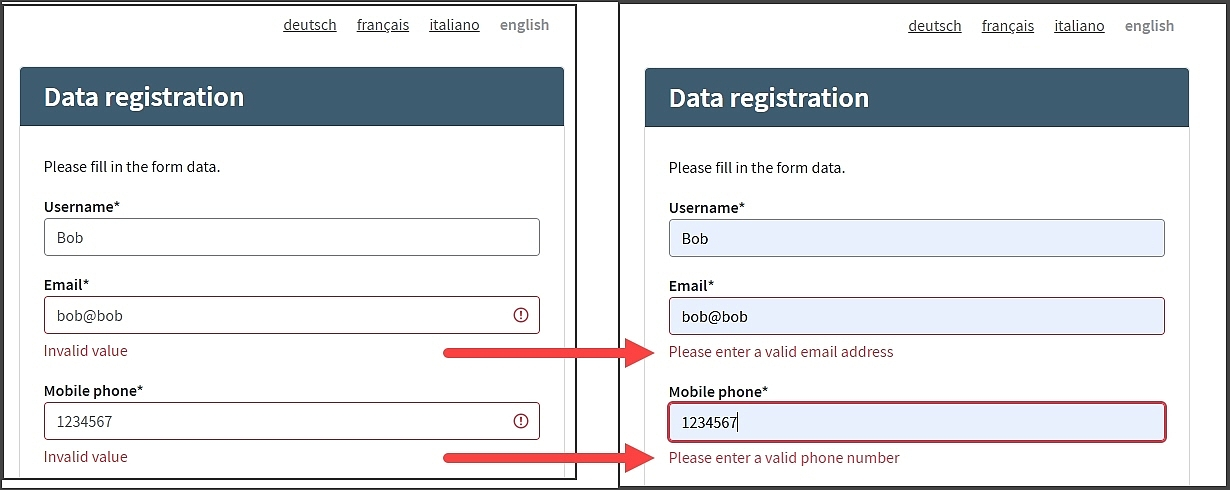
The image below shows two versions of the self registration window.
When a validation error occurs
- The Email and Mobile phone fields at the left throw the generic error text “Invalid value”. This corresponds to the following generic translation key entry, which applies to both fields:
error.validation-failed.invalid-value = Invalid value
- The Email and Mobile phone fields at the right throw different error texts that are specific to each field. This is achieved with the following field-specific translation key entries:
error.validation-failed._field.email._type.invalid-value = Please enter a valid email address
error.validation-failed._field.mtanNumber._type.invalid-value = Please enter a valid phone number
<field> value for translations
The following table shows where to find the <field> value needed for the translation key for field-specific error messages. The column on the left lists the user data plugin that defines the respective UI field. The column on the right provides the plugin's property that contains the <field> value.
User data plugin defining UI field | Value used for |
|---|---|
Username User Item | Fix value: |
Password User Item | Possible values:
|
| Key property |
| Context Data Name property |
Custom UI | Self-chosen <field> value |
Adding landmarks for content sections
A landmark defines a navigational region on a page (for example header, main content, or footer). Landmarks allow assistive technologies such as screen readers to quickly locate and navigate between important sections of the page.
Starting with version 8.6, landmarks for the page header, main content and footer are automatically enabled for installations that use the provided default Loginapp UI with WCAG mode enabled. Installations that use customized HTML templates must add the required landmarks manually to remain WCAG compliant.
To configure landmarks, modify the following custom HTML templates located in $CUSTOM_DIRECTORY/src/assets/custom/templates/layout:
default-header.htmldefault-content.htmldefault-footer.html
Screen readers recognize landmarks through ARIA attributes or appropriate HTML tags. ARIA labels provide an accessible name for an element when the visible interface does not contain sufficient descriptive text. Each template must therefore contain an appropriate aria-label.
Proceed as follows
- To adjust the
default-header.htmlfile: - Remove the landmark role
“header”from the upper<div>element (with classiam-container), if applicable. - Define the landmark by either
- setting the landmark role
“banner”, or - explicitly adding a
<header>tag.
- setting the landmark role
- Add the ARIA label
aria-label=“{{#translate}}general.aria-label.header{{/translate}}”to either - the
<div>element containing the“banner”landmark role, or - the
<header>element.
- the
- To define the text used by the ARIA label, add the translation key
general.aria-label.headerto the appropriate custom language.propertiesfile located in$CUSTOM_DIRECTORY/src/assets/custom/i18n. Example:
- Example
general.aria-label.header = Top navigation bar
- Remove the landmark role
The sample code snippet below illustrates the previous instructions. Here, a
<header>tag is added, containing thearia-labelattribute.- To adjust the
default-content.htmlfile: - Define the landmark by either
- setting the landmark role
“main”, or - explicitly adding a
<main>tag.
- setting the landmark role
- Add the ARIA label
aria-label="“{{#translate}}general.aria-label.main{{/translate}}”"to either - the
<div>element containing the“main”landmark role, or - the
<main>element.
- the
- To define the text used by the ARIA label, add the translation key
general.aria-label.mainto the appropriate custom language.propertiesfile located in$CUSTOM_DIRECTORY/src/assets/custom/i18n. Example:
- Example
general.aria-label.main = Main content area
The sample code snippet below illustrates the previous instructions. Here, the
aria-labelattribute is added to the<div>element containing the“main”landmark role.- To adjust the
default-footer.htmlfile: - Remove the landmark role
“footer”from the upper<div>element (with classiam-container), if applicable. - Define the landmark by either
- setting the landmark role
“content-info”, or - explicitly adding a
<footer>tag.
- setting the landmark role
- Add the ARIA label
aria-label=“{{#translate}}general.aria-label.footer{{/translate}}”to either - the
<div>element containing the“content-info”landmark role, or - the
<footer>element.
- the
- To define the text used by the ARIA label, add the translation key
general.aria-label.footerto the appropriate custom language.propertiesfile located in$CUSTOM_DIRECTORY/src/assets/custom/i18n. Example:
- Example
general.aria-label.footer = Bottom navigation bar
- Remove the landmark role
The sample code snippet below illustrates the previous instructions. Here, a
<footer>tag is added, containing thearia-labelattribute.
Configuring skip links
Skip links allow keyboard and screen reader users to jump directly to a specific page section instead of navigating through repeated elements such as headers, navigation bars, or language switchers.
Starting with IAM version 8.6, skip links are automatically enabled for installations that use the provided default Loginapp UI with WCAG mode enabled. In these installations, the Loginapp provides skip links to the header, main content and footer sections of a page for all default languages (English, German, French, Italian).
You must configure skip links manually if you:
- Use customized HTML templates for the Loginapp
- Use the default Loginapp UI, but want to add skip links to page sections other than the header, main content or footer
Manual configuration of skip links
This section explains how to implement skip links for the header, main content, and footer areas when using customized Loginapp HTML templates.
To implement skip links in customized HTML templates, proceed as follows:
- The skip link menu should be the first focusable element on the page so keyboard users encounter it immediately. Usually, this would be at the top of the
<body>element. Add the following<nav>element: - The skip links must point to the elements representing the header, main content, and footer.
For each skip link,
- Take the
hrefvalue from the corresponding<a>element in the code snippet above. For example,
#iamHeaderContainerfrom<a href=“#iamHeaderContainer” ... </a>- Remove the # and use the remaining value as an
id. Ensure that an element with thisidexists in the correct location on the page (e.g., the header container).
- Take the
- To define the text used by the ARIA labels, add the following translation keys to the appropriate custom language
.propertiesfile located in$CUSTOM_DIRECTORY/src/assets/custom/i18n: general.aria-label.skip-links- ARIA label for the skip link menu.
For example:general.aria-label.skip-links = Navigationgeneral.skip-links.header- Skip link text to the header area.
For example:general.skip-links.header = Skip to headergeneral.skip-links.main- Skip link text to the main content area.
For example:general.skip-links.main = Skip to main contentgeneral.skip-links.footer- Skip link text to the footer area.
For example:general.skip-links.footer = Skip to footer
You do not have to add skip links to all three areas: header, main content and footer. You can decide which skip links to include. For example, you could add a single skip link to the main content area. However, the target should always be on the same page.
Adding skip links
You can also add skip links to additional page sections beyond the header, main content, and footer. Proceed similar to the instructions above:
For each additional skip link
- Add an
<a>element referring to the corresponding page area to the skip link navigation element<nav>. For example:
<a href="#iamareaXContainer" class="iam-skip-link iam-btn">{{#translate}}general.skip-links.areaX{{/translate}}</a>- Define the target landmark, by adding the link reference specified in the previous step to the container representing the respective page area.
For example:
<div id="iamareaXContainer"> <div class="iam-container iam-areaX-container"> ... </div> </div>- To define the skip link text, add the corresponding translation key
general.skip-links.areaXto the appropriate custom language.propertiesfile in$CUSTOM_DIRECTORY/src/assets/custom/i18n.
Changing the skip links location
By default, the skip link menu appears in the upper-left corner of the page:

This corresponds with the default styling settings in the following code block:
To relocate the skip links menu, adjust the above code accordingly.
Example
The following screenshot shows a horizontal skip link menu placed centrally on top of the page:

To realize this, add the following code snippet to your custom_styles.scss file:
Configuring field autocompletion
Starting with IAM version 8.6, the Loginapp UI supports browser autocomplete for the username, password, and one-time password fields. Autocomplete is a browser feature that automatically fills form fields using previously stored user data.
The autocompletion feature is automatically enabled for installations that use the provided default Loginapp UI with WCAG mode enabled.
Manual configuration is required if you:
- Use customized HTML templates for the Loginapp UI.
- Use the provided default Loginapp UI, but want to add autocompletion for input fields other than the username, password and one-time-password field.
Autocompletion is achieved by setting the autocomplete HTML attribute in the respective UI field definition. The value of the autocomplete attribute must match the Input Purpose property of the corresponding user data plugin that defines the UI field.
The following example shows how autocomplete is configured for the Username field. Here, the value of the autocomplete attribute is username, which matches with the value of the Input Purpose property of the corresponding Username User Item plugin.

The table below lists the default autocompletion settings for the username, password and one-time password fields in the default Loginapp UI. If you use customized HTML templates, you must set the autocomplete attribute manually.
UI input field | Value | Corresponding plugin with Input Purpose property |
|---|---|---|
Username |
| Username User Item |
Password |
| Password User Item |
One-time password fields |
|
Input fields that support autocompletion
Additionally, you can enable autocompletion for multiple other input fields, such as email, date of birth, name, address (town), and mTAN number, as well as for custom UI fields. The following user data plugins store user data, can define UI input fields, and support the Input Purpose property.
List of plugins with Input Purpose field:
- Email Item Definition (class:
EmailItemDefinitionConfig). Stores email addresses. - mTAN Number Item Definition (class:
MtanNumberItemDefinitionConfig). Stores mTAN numbers (usually the user's mobile number). - mTAN Label Item Definition (class:
MtanLabelItemDefinitionConfig). Stores labels for mTAN numbers. - Date And Time User Context Data Item (class:
DateAndTimeContextDataItemDefinitionConfig). Stores user context data consisting of a date and time value. - Date User Context Data Item (class:
DateContextDataItemDefinitionConfig). Stores user context data consisting of a date value, such as date of birth. - Enumeration User Context Data Item (class:
EnumContextDataItemDefinitionConfig). Stores user context data consisting of a string value out of a fixed set of allowed strings. - String User Context Data Item (class:
StringContextDataItemDefinitionConfig). Stores user context data consisting of a string value, such as name or address. - Password User Item (class:
PasswordDefinitionConfig). Stores the user's password. - Username User Item (class:
UsernameDefinitionConfig). Stores the user's username. - Alias User Item (class:
AliasDefinitionConfig). Stores a context data item that can be used as a login name in the same way as the username. - Input UI Element (class:
ConfigurableUiInputFieldConfig). Used to configure an input field for a custom UI form, e.g., for a (customized) authentication or self-registration flow. - Date UI Element (class:
ConfigurableUiDateConfig). Used to configure a date field for a custom UI form, e.g., for a (customized) authentication or self-registration flow. - Drop-Down UI Element (class:
ConfigurableUiDropDownConfig). Used to configure a drop-down field for a custom UI form, e.g., for a (customized) authentication or self-registration flow.
More information
- WCAG 2.2 recommends using the following input purposes for the most common input fields: WCAG 2.2 input purposes
- Here you find further information on which input fields correspond with which input purposes: WCAG 2.2 Input fields and purposes
Further information and links
Internal links