Changing the Loginapp UI appearance with the Design Kit

This article describes several options to customize the appearance of the Loginapp UI with the Loginapp Design Kit.

 
Info

All customizations described here can be implemented by creating a new customizations build (with the CLI of the Loginapp Design Kit) and deploying this build to your productive IAM instance. For more information on the CLI of the Design Kit, see Using the Design Kit CLI.

Styling using Sass and CSS

You can customize the look and feel of the Loginapp UI using Sass or plain CSS. The relevant files needed for customization are located in $CUSTOM_DIRECTORY/src/sass/custom. This directory contains the following customization files:

  • _custom-variables.scss
    The Loginapp Design Kit provides Sass variables to quickly customize the Loginapp UI. For a list of these variables, see below. To customize the Loginapp UI, copy the corresponding Sass variable from the list, add it to the _custom-variables.scss file and adapt it as required.
  • The following example illustrates how to use the _custom-variables.scss file for customizations of default Sass variables:

  •  
    Example
    // Example 1) change the primary color of the Loginapp (i.e., the color of the title bar):
    $iam-primary-color: rgb(95 45 129); // Example 2) change the font:
    $iam-font-family-base: 'TypoPRO Clear Sans', sans-serif;
  • _custom-styles.scss
    The Sass variables are an easy and quick way to get started with customizing the Loginapp UI. If more advanced customizations are required, add custom Sass or just plain CSS styles to the _custom-styles.scss file.
  • The following example illustrates how to use the _custom-styles.scss file for advanced customizations based on plain CSS:

  •  
    Example
    // Example 1) align buttons left instead of right:
    .iam-button-group { .iam-btn { float: left !important; margin-left: 0 !important; margin-right: $spacer; } .iam-btn-wrapper { float: left !important; } } // Example 2) Hiding the language selection:
    .iam-language-switcher { visibility: hidden; } // Example 3) Making the container on the login page smaller:
    #iamAuthPassword .iam-card { width: 480px; margin-left: auto; margin-right: auto; }

List of available Sass variables

The list below contains all Sass variables supported by the Loginapp UI.

 
Example
/** **************
 * Colors
 * **************/
$iam-color-black: #000 !default;
$iam-color-white: #fff !default;
$iam-color-gray-dark: #373a3c !default;
$iam-color-very-dark-gray: #555 !default;
$iam-primary-color: rgb(62 92 112) !default;

/** **************
 * Font
 * **************/
$iam-font-family-base: 'TypoPRO Source Sans Pro', sans-serif !default;
$iam-font-size-base: 1rem !default;

/** **************
 * Basic settings
 * **************/
$iam-body-color: #212529 !default;
$iam-body-bg: $iam-color-white !default;
$iam-line-height-base: 1.5 !default;
$iam-border-radius: .25rem !default;
$iam-border-width: 1px !default;

/** **************
 * Header, content, footer containers
 * **************/
$iam-header-container-padding: 0 15px !default;
$iam-header-container-full-width: false !default;
$iam-content-container-padding: 0 15px !default;
$iam-content-container-full-width: false !default;
$iam-footer-container-padding: 0 15px !default;
$iam-footer-container-full-width: false !default;

/** **************
 * Logo
 * **************/
$iam-show-logo: true !default;
$iam-logo-url: product-asset('img/logo.svg') !default;
$iam-logo-width: 95px !default;
$iam-logo-height: 35px !default;

/** **************
 * Portal Target
 * **************/
$iam-portal-target-icon: product-asset('img/icon-target.svg') !default;
$iam-portal-target-mobile-right-icon: product-asset('img/icon-chevron-compact-right.svg') !default;
$iam-portal-target-mobile-right-icon-white: product-asset('img/icon-chevron-compact-right-white.svg') !default;

/** **************
 * Loader
 * **************/
$iam-loader-show: true !default;
$iam-loader-logo-url: $iam-logo-url !default;
$iam-loader-logo-width: $iam-logo-width !default;
$iam-loader-logo-height: $iam-logo-height !default;
$iam-loader-animated-circle: true !default;
$iam-loader-animated-circle-size: 200px !default;
$iam-loader-animated-circle-thickness: 2px !default;
$iam-loader-animated-circle-color: $iam-primary-color !default;

/** **************
 * Links
 * ***************/
$iam-link-color: #555 !default;
$iam-link-decoration: underline !default;
$iam-link-hover-decoration: none !default;

/** **************
 * Logout Link
 * ***************/
$iam-show-logout-link: false !default;
$iam-show-logout-link-icon: product-asset('img/logout.svg') !default; // Use false if no icon required
$iam-hide-logout-link-icon-on-small-devices: false !default;
$iam-hide-logout-link-text-on-small-devices: true !default;

/** **************
 * Cards
 * **************/
$iam-card-header-font-size: $iam-font-size-base * 1.75 !default;
$iam-card-header-font-weight: bold !default;
$iam-card-header-padding: .5rem 1.5rem !default;
$iam-card-header-text-align: left !default;
$iam-card-header-font-color: $iam-color-white !default;
$iam-card-header-background: $iam-primary-color !default;
$iam-card-border-width: $iam-border-width !default;
$iam-card-border-color: rgba($iam-color-black, .125) !default;
$iam-card-border-radius: $iam-border-radius !default;
$iam-card-body-padding: 1.75rem 1.5rem !default;
$iam-detail-card-header-background: lighten($iam-card-header-background, 60%) !default;
$iam-detail-card-header-font-size: $iam-font-size-base * 1.25 !default;
$iam-detail-card-header-padding: .1rem 1.5rem !default;
$iam-detail-card-header-font-weight: bold !default;
$iam-detail-card-header-font-color: $iam-body-color !default;
$iam-detail-card-body-padding: 1rem 1.5rem;
$iam-detail-card-margin-bottom: 1rem !default;

/** **************
 * Buttons
 * ***************/
$iam-btn-primary-bg: $iam-color-white !default;
$iam-btn-primary-color: $iam-color-gray-dark !default;
$iam-btn-primary-border: 1px solid $iam-color-very-dark-gray !default;
$iam-btn-border-radius: $iam-border-radius !default;
$iam-btn-transition: color .15s ease-in-out, background-color .15s ease-in-out, border-color .15s ease-in-out, box-shadow .15s ease-in-out !default;

/** **************
 * Forms
 * **************/
$iam-input-border-color: #ced4da !default;
$iam-input-focus-border-color: lighten($iam-input-border-color, 25%) !default;
$iam-input-color: #55595c !default;
$iam-input-padding-y: .375rem !default;
$iam-input-padding-x: .75rem !default;
$iam-input-height: (($iam-font-size-base * $iam-line-height-base) + ($iam-input-padding-y * 2)) !default;
$iam-input-transition: border-color .15s ease-in-out, box-shadow .15s ease-in-out !default;
$iam-form-group-margin-bottom: 1rem !default;
$iam-label-font-weight: bold !default;
$iam-label-always-on-top: false !default;
$iam-form-required-content: '*' !default;
$iam-form-required-content-color: $iam-color-gray-dark !default;
$iam-form-required-content-size: inherit !default;
$iam-form-required-content-vertical-align: baseline !default;
$iam-form-feedback-invalid-color: #dc3545 !default;
$iam-form-feedback-enable-validation-icons: true !default;
$iam-show-password-toggle: false !default;

/** **************
 * Alerts
 * **************/
$iam-alert-border-radius: $iam-border-radius !default;
$iam-alert-danger-text: #721c24 !default;
$iam-alert-danger-bg: #f8d7da !default;
$iam-alert-danger-border: darken($iam-alert-danger-bg, 5%) !default;
$iam-alert-warning-text: #856404 !default;
$iam-alert-warning-bg: #fff3cd !default;
$iam-alert-warning-border: darken($iam-alert-warning-bg, 5%) !default;
$iam-alert-success-text: #155724 !default;
$iam-alert-success-bg: #d4edda !default;
$iam-alert-success-border: darken($iam-alert-success-bg, 5%) !default;
$iam-alert-info-text: #0c5460 !default;
$iam-alert-info-bg: #d1ecf1 !default;
$iam-alert-info-border: darken($iam-alert-info-bg, 5%) !default;

Use case 1 - Enabling the “Show Password” toggle

You can use the Loginapp Design Kit to enable the “Show Password” toggle. This toggle allows end-users to see their entered password in plaintext. The toggle itself is an eye icon visible on the right-hand side of the Password input field.

To enable the toggle, add the variable $iam-show-password-toggle to the _custom-variables.scss file and set it to true (the default is false):

 
Example
$iam-show-password-toggle: true;
 
Notice

This feature is available as of release 8.4. To enable the feature in an older SDK setup, store the eye icons as svg files under $CUSTOM_DIRECTORY/src/assets/custom/img. Use the following file names:

  • eye-regular.svg
  • eye-slash-regular.svg

Additionally, refer to the “old” src folder from a newer SDK setup (version 8.4 or higher).

Once you have deployed this change, the “Show Password” toggle is visible in the Password input field on the username/password login and password reset pages of your web application:

  • /<path-to-your-application>/password
  • /<path-to-your-application>/password-only
  • /<path-to-your-application>/password/change

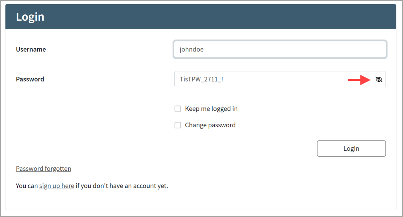
The following screenshot shows an username/password login page with an enabled “Show Password” toggle:

Use case 2 - Referencing custom static files

Custom static files, like images or fonts, should be stored in the $CUSTOM_DIRECTORY/src/assets/custom directory. To reference the custom static files (also called assets) in the $CUSTOM_DIRECTORY/src/assets/custom directory, we recommend using the Sass function custom-asset.

For example, to refer to your custom logo image in the $CUSTOM_DIRECTORY/src/assets/custom directory, add the Sass variable $iam-logo-url to the _custom-variables.scss file and adapt it as follows (note that the specified path is relative to the $CUSTOM_DIRECTORY/src/assets/custom directory):

 
Example
$iam-logo-url: custom-asset('img/your_logo_file_name.svg');

Use case 3 - Changing the favicon

To change the favicon of the Loginapp UI, replace the default favicon.ico in the $CUSTOM_DIRECTORY/src/assets/custom/img directory with your custom favicon.

Use case 4 - Dropping all IAM styling

If your required look and feel differs a lot from the Airlock IAM default styles, you may want to drop all provided styling and start from scratch. The Loginapp Design Kit allows for this, by enabling the following option: $CUSTOM_DIRECTORY/src/sdk/config/custom.sdk.config.js

 
Example
config.build = { 
    dropStyles: true 
};
 
Notice

As a consequence of dropping all standard styles, variables defined in the _custom-variables.scss file no longer have any effect. Instead, all Sass/CSS adjustments have to be done in the _custom-styles.scss file.

Further links and information