Generic Token Controller UI configuration

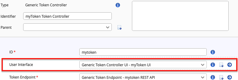
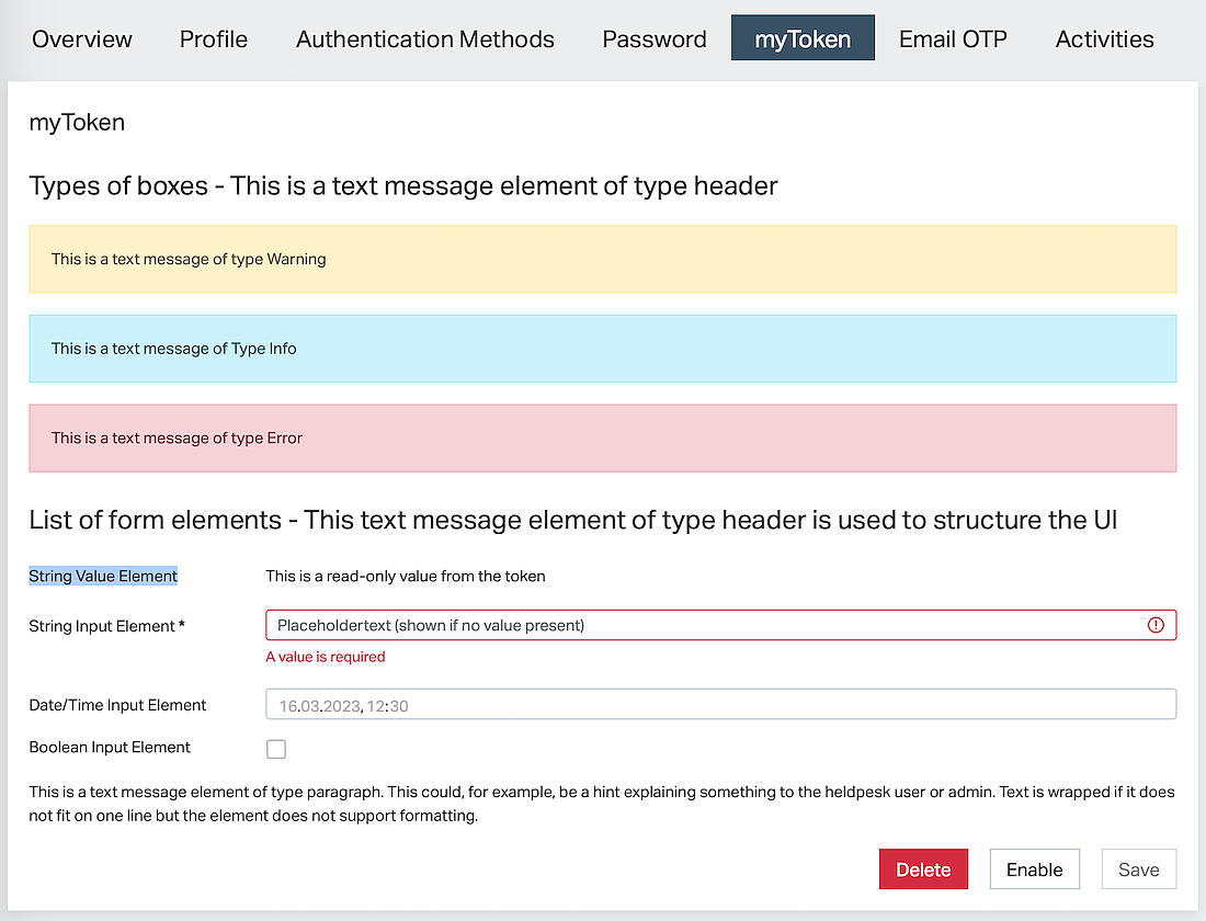
IAM offers a configurative approach to creating the UI for a generic token. Both the user interface and the token endpoint that provides the REST API for the UI are part of the Generic Token Controller configuration. This article is about UI configuration.

GenericTokenControllerConfig

Note that the Generic Token Controller's UI plugins have been replaced by this simpler plugin in IAM 8.0.

The User Management Extension in the IAM Adminapp provides full flexibility regarding custom user and token management UIs.

Supported Features

The Generic Token Controller UI renders a form used to display and manage token data provided by its Generic Token Controller. Moreover, it offers the user different management operations on the token (add, delete, activate, etc.).

What information and input elements are shown is defined by the configuration.

  • The UI basically consists of the following parts:
  • A list of tokens with details, input elements, and action buttons.
  • An Add button to add new tokens
  • One section about activation letters.

For each token, a list of configured elements is shown. The following types of elements are supported:

Type

Description

Text message

A configured fixed text message, i.e., the message or its translation key is part of the configuration. It is used to place information in the UI or to structure the UI using headers.

  • There are different ways to render the message:
  • Header: user to structure the UI
  • Info, warning, or error boxes: used to highlight static information.
  • Text in a paragraph: used to explain information or the usage of the action buttons.

String value

Used to display read-only data obtained from the REST API.

Example: display a token ID or a serial number of a token.

String input

An input field bound to an attribute in the REST API.

Used to display read-only or editable information such as a token label.

Date/time input

An input field specialized in dates and points in time.

Used to display read-only or editable information such as a valid-to-date.

Boolean input

An input field specialized in booleans (a checkbox).

Used, for example, for locking and unlocking a token.

Example UI

The following example UI shows all types of UI elements on one token, the activation letter section, and the Add button.

Adminapp - menu Users, tab myToken

Configuration

The UI is configured within the Generic Token Controller plugin in the property User Interface. Consider the following hints on selected configuration properties of the Generic Token Controller UI:

Please refer to the property documentation in the Config Editor for all other configuration properties.

Property

Hints

UI Elements

  • This is the list of UI elements shown for each token in the configured order. See above for different types and an example.
  • Use Text Message Controller Element plugins and choose the type Header to structure the displayed information of each token.
  • In the UI elements that use data from the displayed token (via REST API), make sure to use exactly the same property names as defined in the token endpoint configuration (attribute mapping) of the Generic Token Controller plugin.
  • Most UI elements allow defining, whether properties without values are displayed at all and if it is read-only
  • All configured labels and configured values are interpreted as translation keys to look up language-dependent texts. If no translation is found, the configured text is displayed directly.

Show Add Button

  • Defines whether a button is shown to add another token to the list of tokens.
  • Note that, even if the checkbox is enabled, no button is shown, if the underlying token endpoint does not allow adding more tokens. The maximum number of tokens may be limited by the token endpoint.

Show Enable/Disable Button

Shows or hides an Enable or Disable button (depending on the current state of the token).

Note that the button is only shown if the "Enabled" attribute is mapped in the token endpoint's attribute mapping. It is not supported by the Identity Attribute Mapping plugin.

Note that the visibility of elements and buttons and whether input elements are read-only or not also depends on the logged-in administrator's permissions (Adminapp >> Access Control).

Internationalization (i18n) for labels

The IAM Adminapp supports multiple languages. To make the UI of a generic token controller multi-lingual, the corresponding translations for all configured labels and statically configured texts must be provided.

  • The text elements have to be added to either of (xx is the language code like en, de, fr, etc.):
  • ./instances/<instance-name>/adminapp-texts/strings_xx.properties
  • ./instances/common/adminapp-texts/strings_xx.properties

Changes to the translation files are automatically applied (no restart required) after a few seconds. The Adminapp UI needs to be reloaded in the browser to load the latest translations.

In addition to the translation keys chosen in the UI configuration, translations for the following keys must be provided. They are used by the Adminapp to render the label of the token controller's tab, and its title and are used for labels in the Authentication Methods tab (add new type token and select active authentication method).

In the following example, mytoken is the ID in the Generic Token Controller (not the UI plugin).

user.auth-methods.type.mytoken = myToken
user.auth-methods.type.generic.mytoken.title = myToken
user.auth-methods.type.generic.mytoken.new-token = Add a new myToken
user.auth-methods.type.generic.mytoken.existing-token = myToken