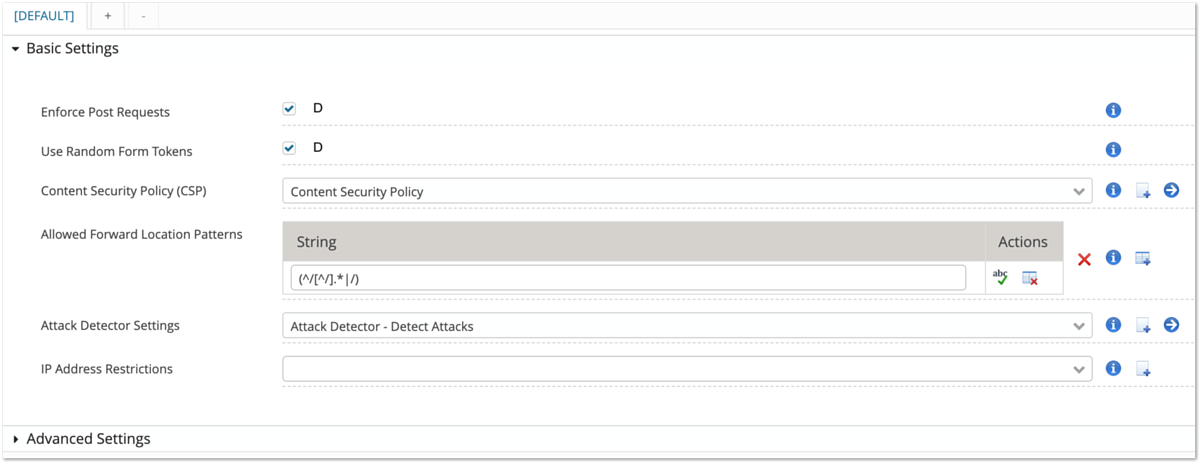
| Shows the documentation of the property. Hint: Click on an info icon, to see the documentation in the "Docs" docking panel at the bottom. |
| In the case of plugin properties, a click on this icon navigates to the sub-plugin. This is the same as clicking on the corresponding plugin in the plugin tree on the left. |
| Adds a new row to a list (only visible for list properties). |
| Removes a row from a list (only visible for list properties). |
| Creates a new sub-plugin configuration (only visible for plugin properties). |
| This icon indicates a validation error for a property value and is displayed on the left side of the field, between the label and the property field. The validation message is displayed when the mouse is placed on the icon. |
| This icon is only informative and has no corresponding action. You find it next to drop-down selection fields that allow new values to be added. That is, if none of the suggested values suits your needs, you can simply enter a new value in the field and press enter to select it. Selection fields without the "plus" icon only allow the selection of the pre-configured values. |
| Opens a regular expression tester. Properties that allow the use of regular expressions have this icon. |
| Opens a dialog to set/change a secret value, e.g. a password. |
| Shows the property value in a separate window. This can be useful if the value is a large text. |
| Executes a small test for a part of the current configuration. Such a testlet may either use only the property of its field or require a set of properties of the plugin. This allows the user to validate the configured properties directly in the Config Editor without the need to apply the configuration first. An example is to test the HTTP connectivity of a configured URL. |
| Indicates that this property is not locally defined and uses its default value. If a property has a default value and the user tries to enter an empty value, the default is automatically inserted into the field and marked with this icon. |
| This icon is displayed only if the plugin has a hierarchical parent configuration, i.e. it may inherit configuration properties from another plugin configuration. Click this icon to override a value locally, i.e. use the defined value and not the value inherited from the parent. |
| This icon is displayed only if the plugin has a hierarchical parent configuration and this property is overwriting the configuration value defined in the parent configuration. Click this icon to inherit a value, i.e. discard the "locally" defined value and use the value defined by the hierarchical parent configuration. |
| Undefines a property by removing its value from the configuration. If the property has a default, it is automatically applied to the field. This icon is only visible on specific types of fields, i.e. checkboxes, maps, and lists. For text fields and drop-downs, a property can be undefined by entering an empty value in the field. The icon is only visible if the property is optional, has a value and there is no hierarchical parent configured for the plugin. The reason is that mandatory properties always require a value and have no use to remove it. If a hierarchical parent is present, the same behavior is achieved by using the icon. |
| Create a new configuration variable for the property. The feature may need to be activated - refer to the documentation linked below. |
| Indicates that a configuration variable exists for the property. The feature may need to be activated - refer to the documentation linked below. |
